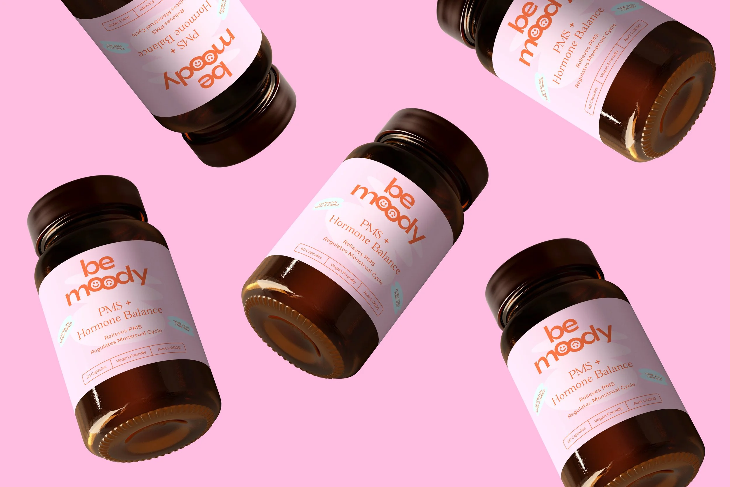
Bemoody is a women’s health supplement brand redefining the conversation around PMS and hormonal balance. Entering a category dominated by soft palettes and familiar wellness cues, the brand needed a clear and confident identity and packaging system that could stand out on shelf and across digital touchpoints.
Bemoody
Scope
Brand Identity
Strategy
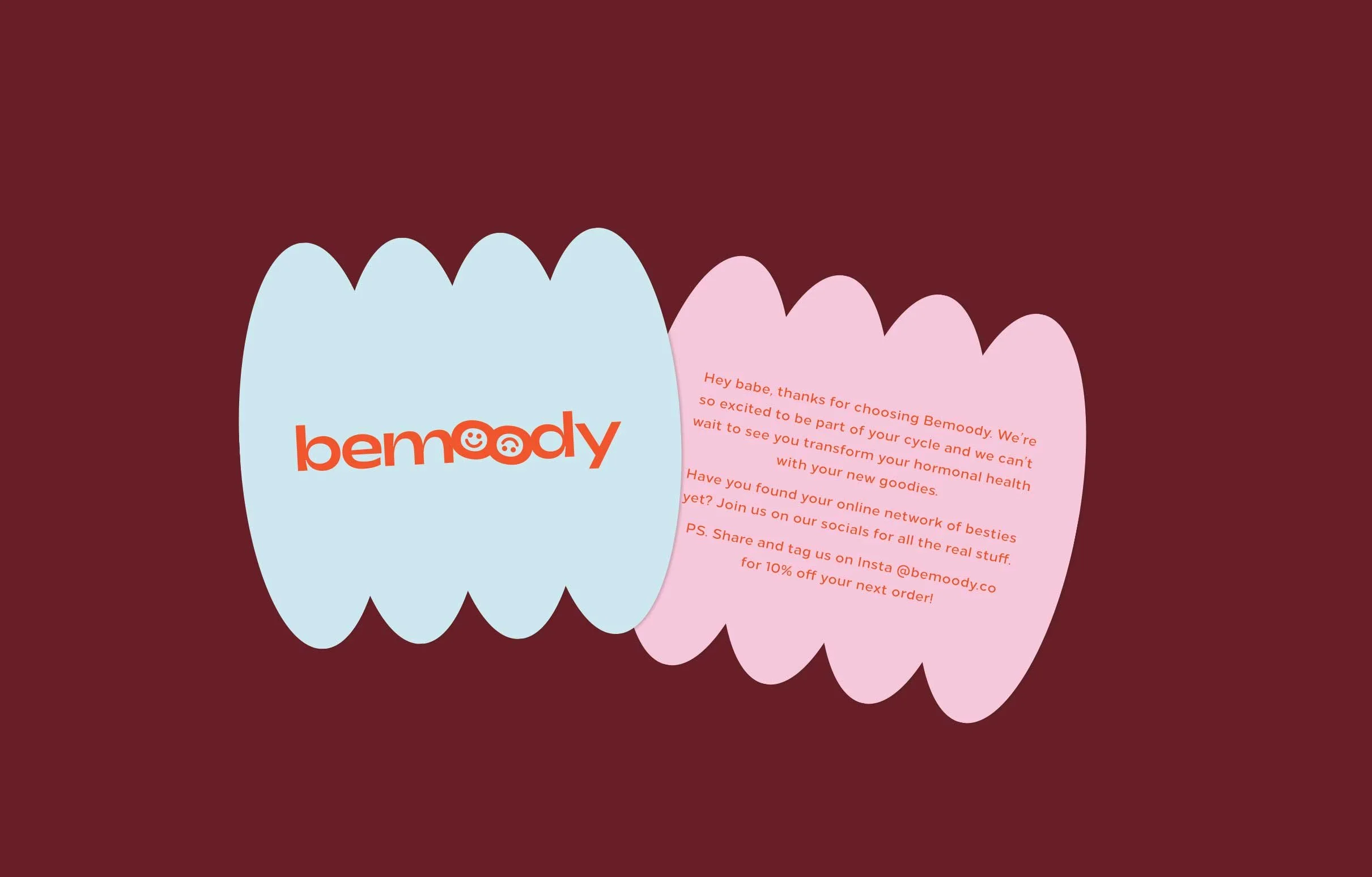
Copywriting
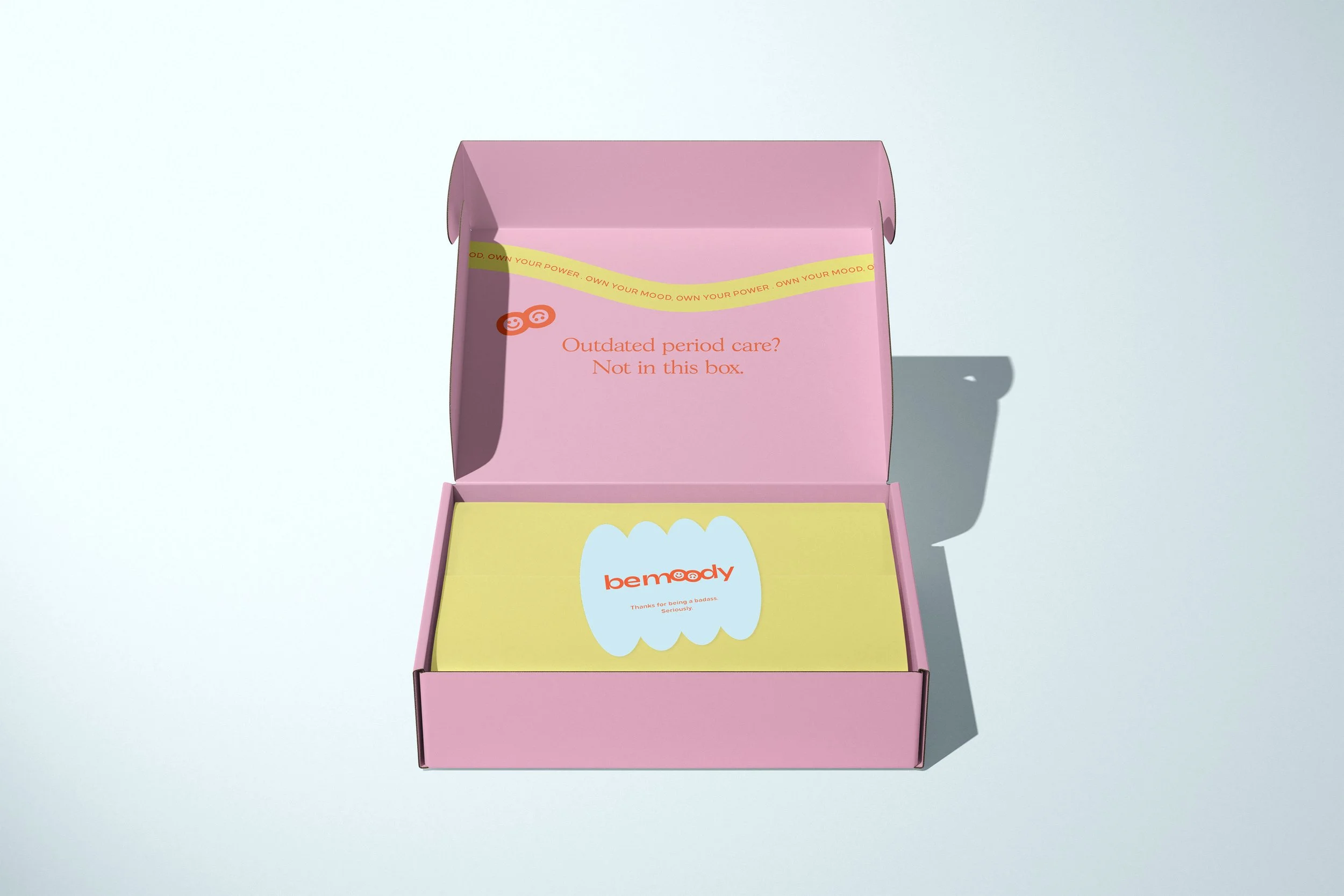
Packaging

Our Approach
We began by clarifying Bemoody’s positioning within the women’s health space, identifying an opportunity to move away from traditional wellness aesthetics and toward a more unapologetic and assertive visual language.
From there, we developed a bold brand identity and packaging system grounded in clarity, hierarchy and consistency. Colour, typography and graphic elements were carefully considered to create strong shelf presence while remaining cohesive and scalable across the range. Every decision was guided by strategic thinking and commercial intent.

The Result
The final brand and packaging system positions Bemoody as a confident and contemporary player in women’s health. With a distinctive presence that cuts through crowded supplement categories, the brand now shows up with clarity, consistency and confidence, ready to grow beyond launch and scale across future products and platforms.